Candlesticks
Anatomy of a Candlestick
Learn how open, high, low, close, candle bodies, and wicks describe price movement on a trading chart.
Updated 2026-06-15
A candlestick compresses a period of price movement into one visual object. On a one-hour chart, one candle shows what happened during one hour. On a daily chart, one candle shows one trading day.
The time period changes, but the candle structure stays the same.
The four prices inside every candle
Every candle is built from four prices:
- Open: where price started during that period.
- High: the highest price reached during that period.
- Low: the lowest price reached during that period.
- Close: where price ended during that period.
These four values are often called OHLC. Once you understand them, a candle becomes a small story about pressure, rejection, and direction.
Body and wick
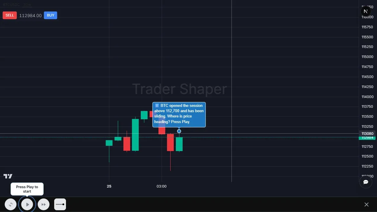
The candle body is the distance between the open and the close. It shows where price started and where it finished.
The wicks, sometimes called shadows, show the extremes. The upper wick reaches toward the high. The lower wick reaches toward the low.
What to read first
- A large body shows stronger movement from open to close.
- A small body shows less progress during the candle period.
- A long wick shows price moved into an area and then pulled back.
- The close matters because it shows where the period finally settled.
Why the close matters
Beginners often focus only on the high and low. The close is just as important because it shows the final result of the period.
For example, if price pushes much higher but closes near the open, buyers did not keep control into the end of the candle. That does not mean price must reverse, but it tells you the move was rejected during that period.
Reading a candle as a story
The easiest way to practice candle anatomy is to narrate the candle in order. Start with the open: that is where the period began. Then look at the high and low to see how far price traveled in both directions. Finally, compare the close with the open and with the full range.
If the close is near the high, buyers finished the period in control. If the close is near the low, sellers finished in control. If the close is near the middle after a wide range, both sides had a turn, and neither fully won. This is more useful than memorizing shape names because it works on every candle.
Body size tells you how much progress happened from open to close. Wick size tells you how much movement failed to hold. A candle with a large body and short wicks reads like a one-sided period. A candle with long wicks on both sides reads like a contested period, even if the body is green or red.
Examples of candle anatomy in context
Imagine a green candle with a large body and almost no upper wick. Price opened near the low, moved higher through the period, and closed near the high. The anatomy says buyers controlled most of the period. If that candle appears after a pullback in an uptrend, it may show buyers returning. If it appears after six large green candles far above support, it may show strength but also extension.
Now imagine a red candle with a long lower wick and a small body near the top of the range. Price opened, sold off hard, then recovered before the close. The candle is red, but the lower prices were rejected. At support, that rejection can be meaningful. In the middle of a noisy range, it may be only volatility.
Finally, imagine a candle with long wicks on both sides and a small body in the middle. Price explored higher and lower, but neither side held control. That anatomy usually reads as conflict or indecision. It is not a trading signal by itself, but it tells you the period was contested.
These examples show why candle anatomy is not just labeling parts. The same open, high, low, and close logic becomes the base for reading strength, rejection, and hesitation.
Common anatomy traps
The first trap is mixing up the open and close on red candles. On a red candle, the open is the top of the body and the close is the bottom. On a green candle, the open is the bottom and the close is the top. That needs to be automatic before pattern reading will feel reliable.
The second trap is treating the wick as less important than the body. The body shows the final outcome, but the wick shows the rejected attempt. A long lower wick says price traded lower and did not stay there. A long upper wick says price traded higher and did not stay there.
The third trap is ignoring timeframe. A candle on a one-minute chart and a candle on a daily chart have the same parts, but they summarize very different amounts of behavior. Always know what period one candle represents before you judge how much the move matters.
How to practice until it is automatic
Pick ten candles on a chart and describe each one in one sentence. Do not predict. Just describe the anatomy. For example: “large green body, tiny upper wick, close near high” or “small body, long lower wick, sellers failed to hold the low.”
Then check whether your description changes when you zoom out. A candle that looked large on a tight zoom may be average inside the broader chart. This teaches scale. Anatomy is objective, but significance is relative to nearby candles and timeframe.
After that, connect the candle to the next lesson: ask whether the candle formed near a swing, support, resistance, or range edge. This is the bridge from anatomy to chart reading. You are not trying to forecast from one candle. You are learning to describe one period accurately so that later structure reads are built on solid information.
Practice goal
When you study candles, do not memorize shapes first. Practice describing what happened:
- Where did price open?
- How far did it travel?
- Where did it close?
- Did the candle leave a long wick?
- Did the body show strong progress or hesitation?